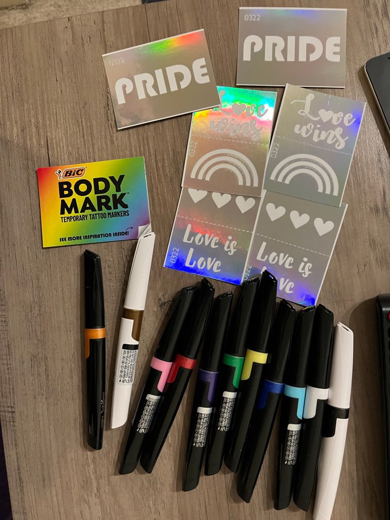
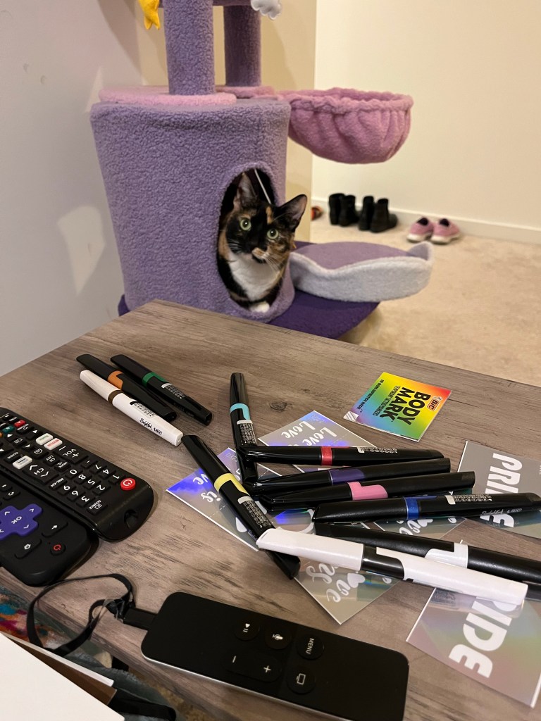
I heard about the BIC Body Mark Temporary Tattoo Markers on TikTok and bought the Pride-themed pack for myself to try. I have wanted a permanent tattoo for a long time but have been very choosy about exactly what, where, and from which artist I want a permanent piece of art on my body that fits my design vision. I am deeply inspired by the work of im________cat (a Korean tattoo artist currently operating out of Toronto), and even had a booking with them when they were a visiting tattoo artist in SF. Tragically I had to cancel my booking because of illness and because the artist was only in SF for a very limited time, I wasn’t able to reschedule. But I still follow them on Instagram and am totally inspired by their style. The temporary tattoo I drew with these markers is my version of im________cat’s style with embellishments personalized to my interest.

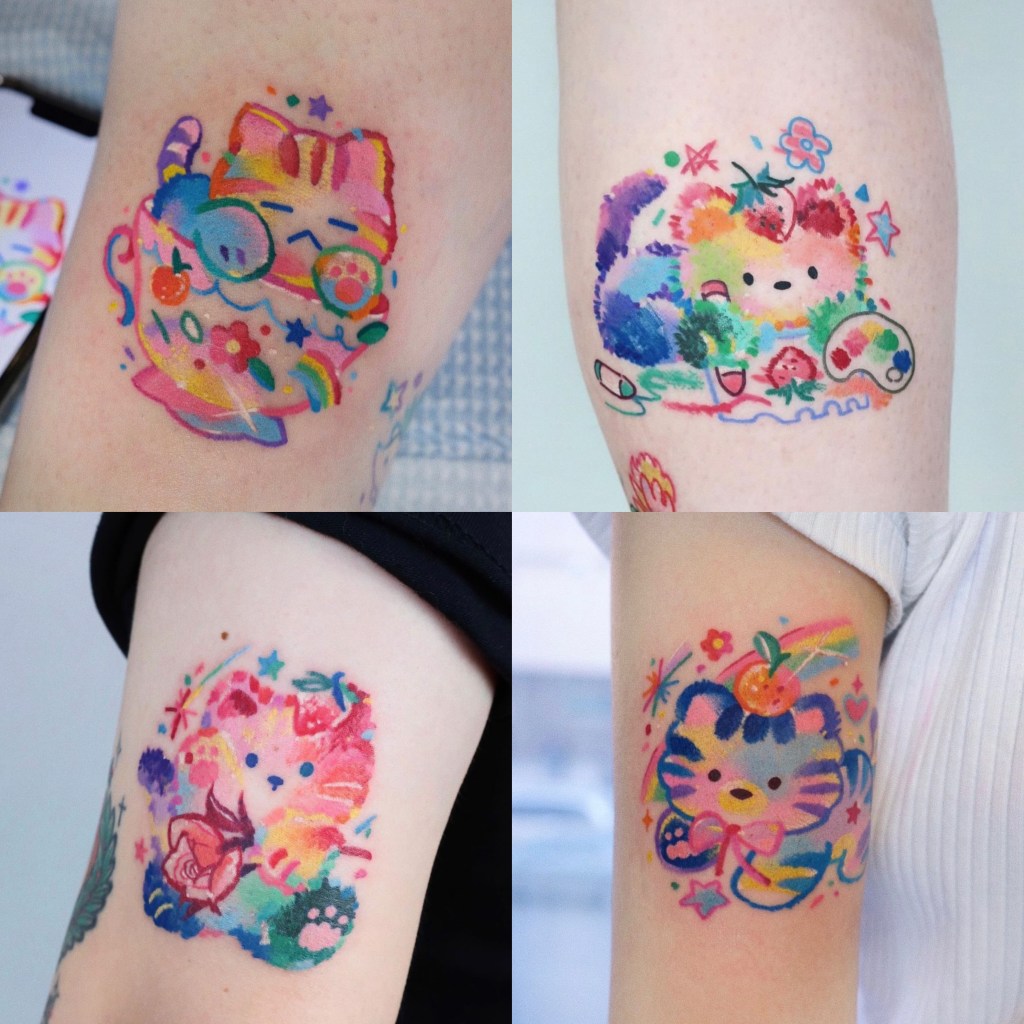
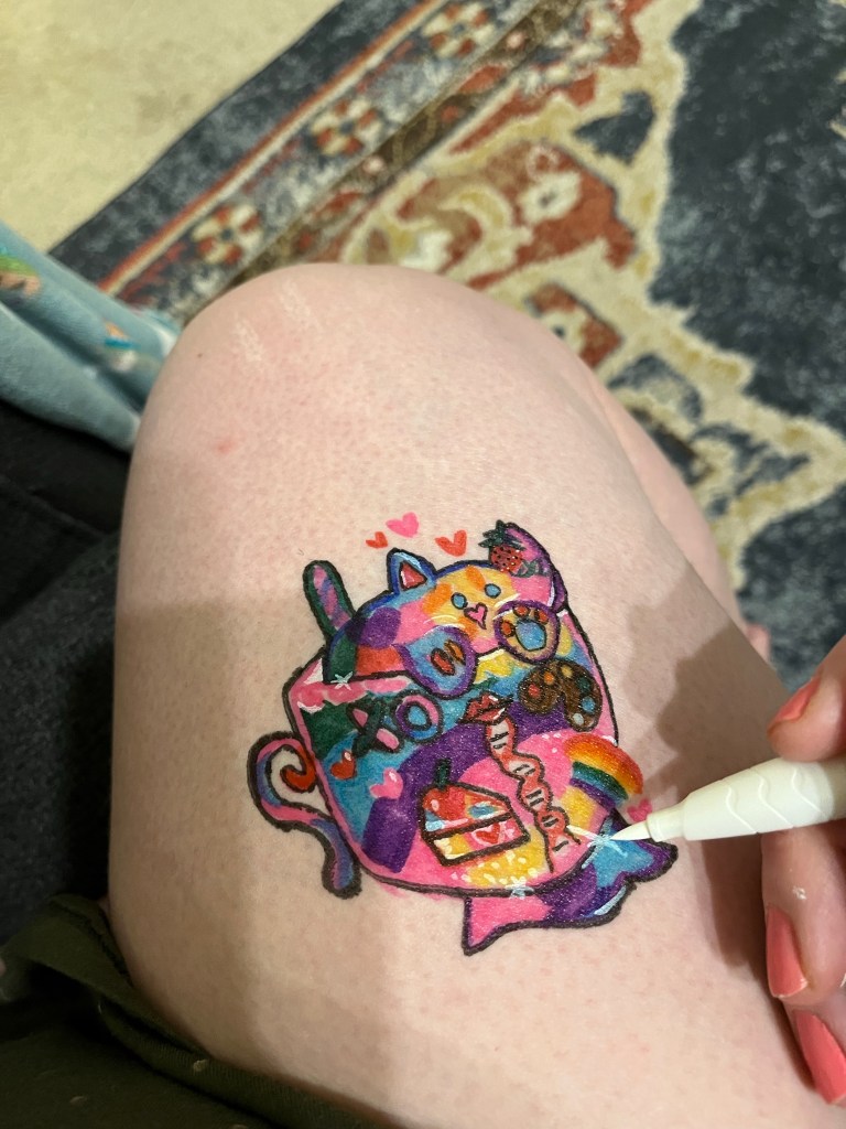
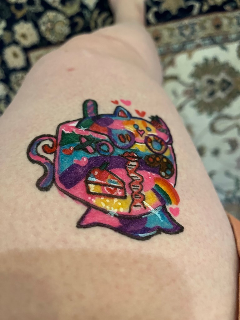
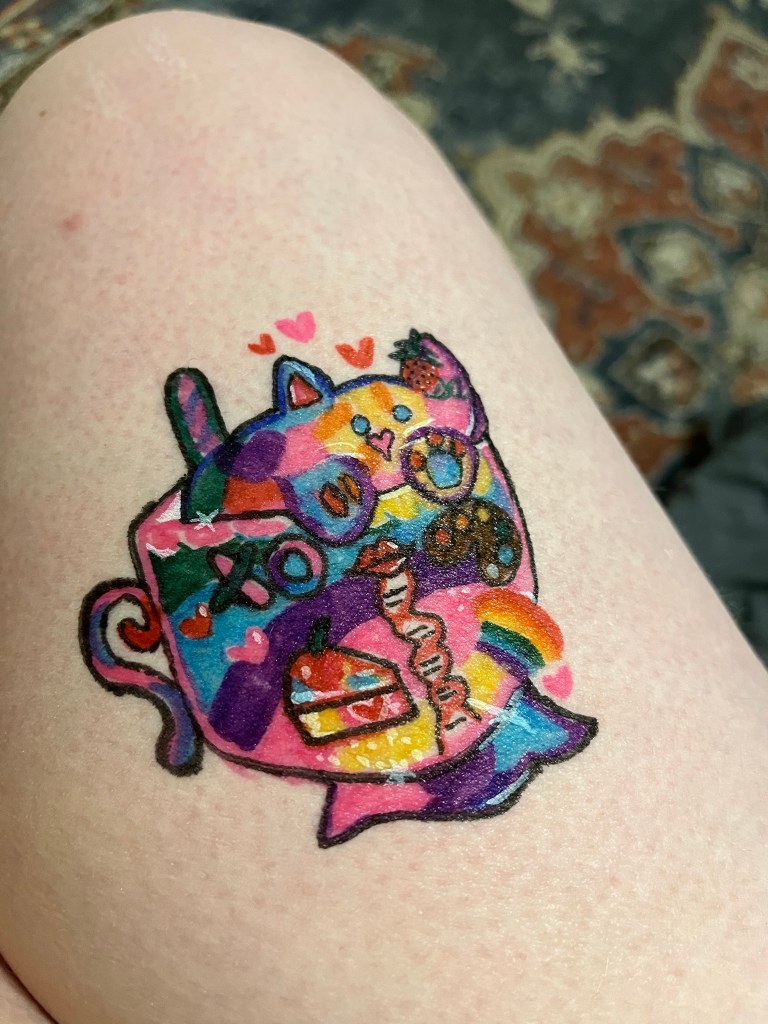
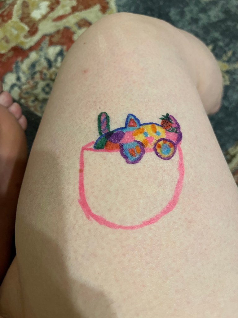
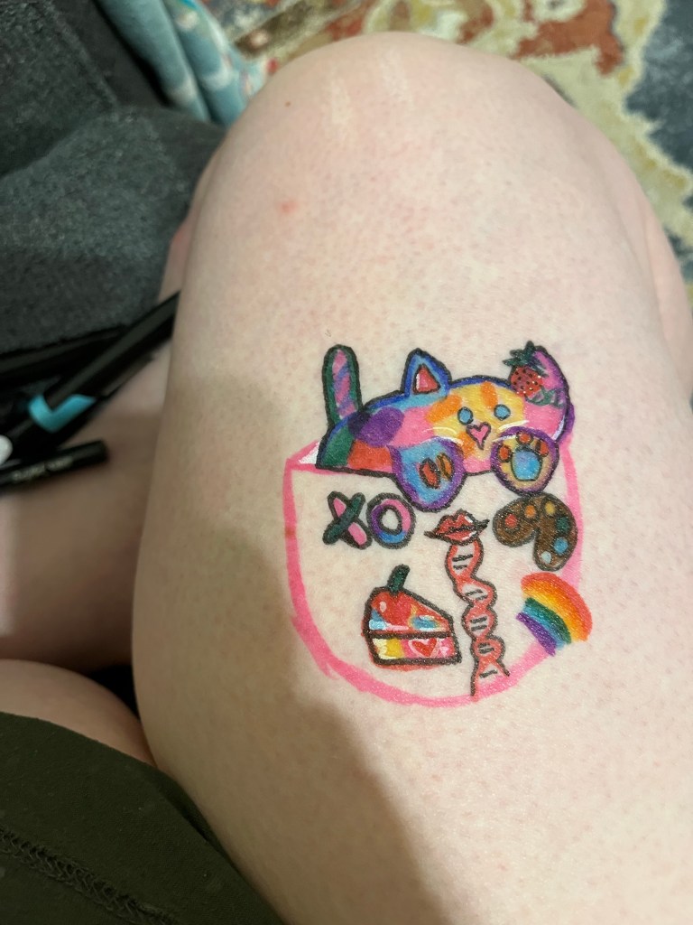
I started by sketching out my temporary tattoo design, which is really just an amalgam of this artist’s for designs displayed above: a rainbow kitty in a cup with a strawberry bow, rainbow, and artist’s palette. To personalize the design, I added DNA to the strawberry (DNA extraction from a strawberry is a common first project for students in biology/biological engineering). I added XO and lips to symbolize love as well as the 23andMe logo in the chromosomes of the X. The lips have DNA that is meant to look almost as if it is being spit from the mouth and is in red to fit thematically with the strawberry bow and red lips. the color patterns on the cat’s face are directly inspired by my tortie cat Esmee’s facial color pattern.
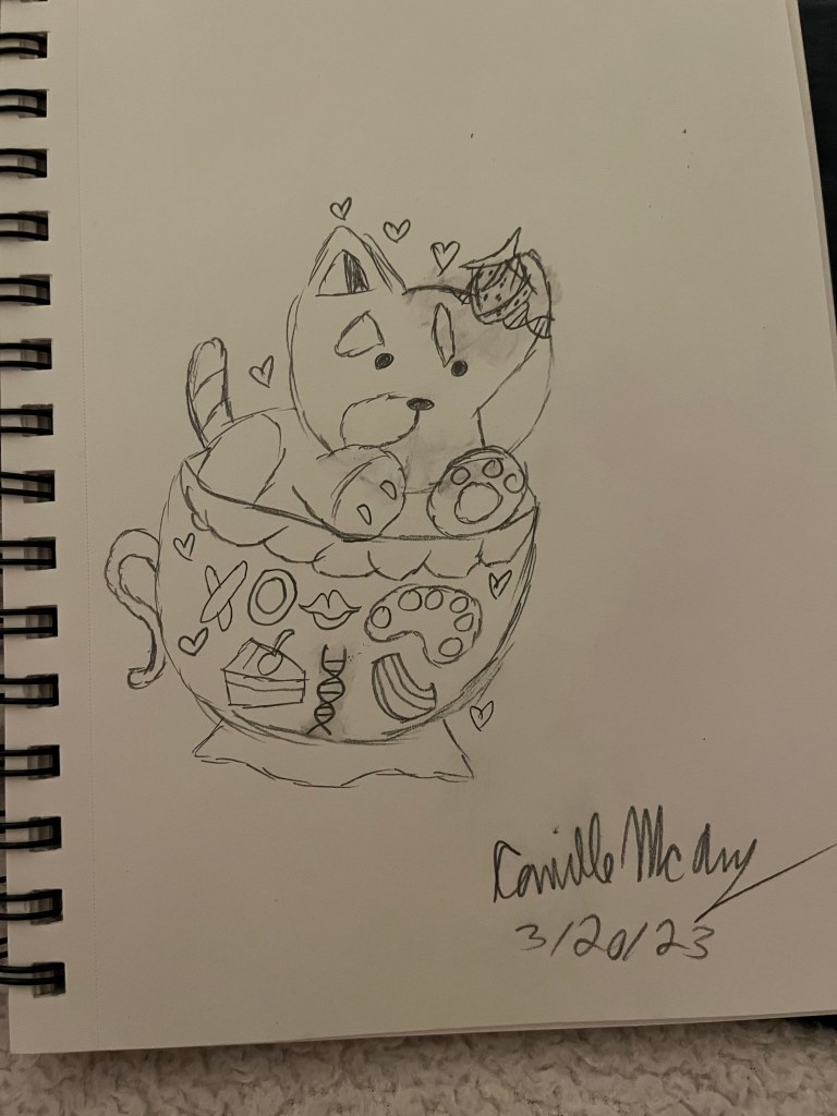

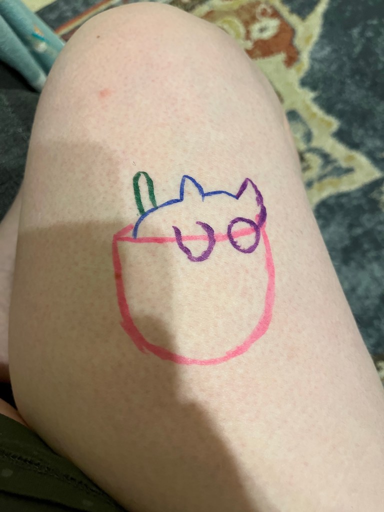
I started my design my sketching the tattoo in color and then filling in the details and finally the color around the details. At some point I realized that because I did not have the full color range (light to dark and especially pastels) of the original artist, that I could better define my design with these markers by outlining with the fine black marker and adding more highlighting details with the white marker.
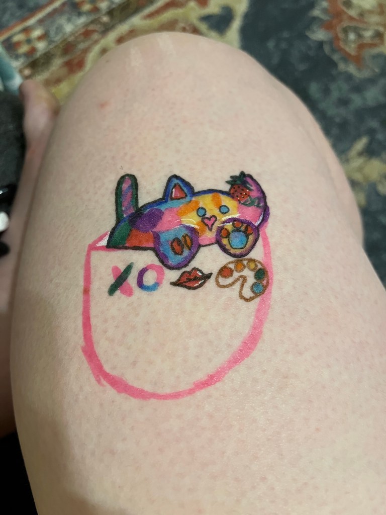
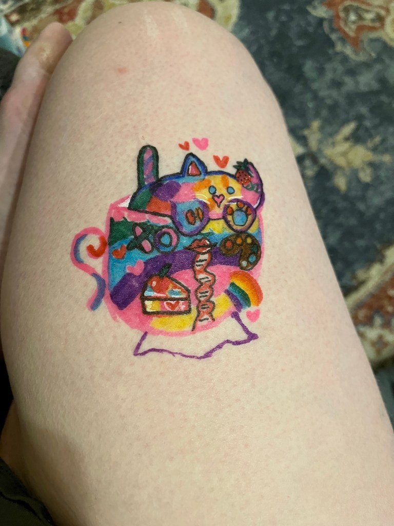
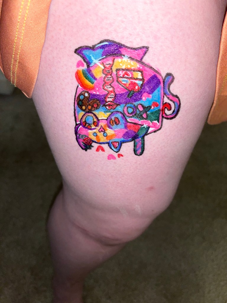
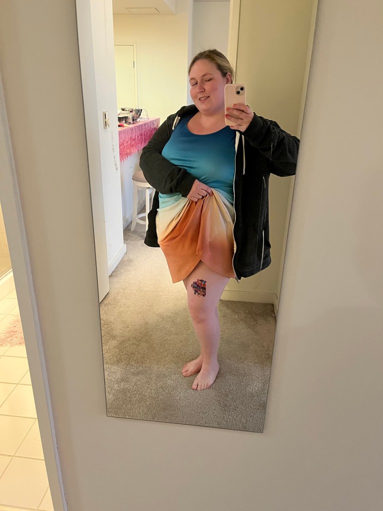
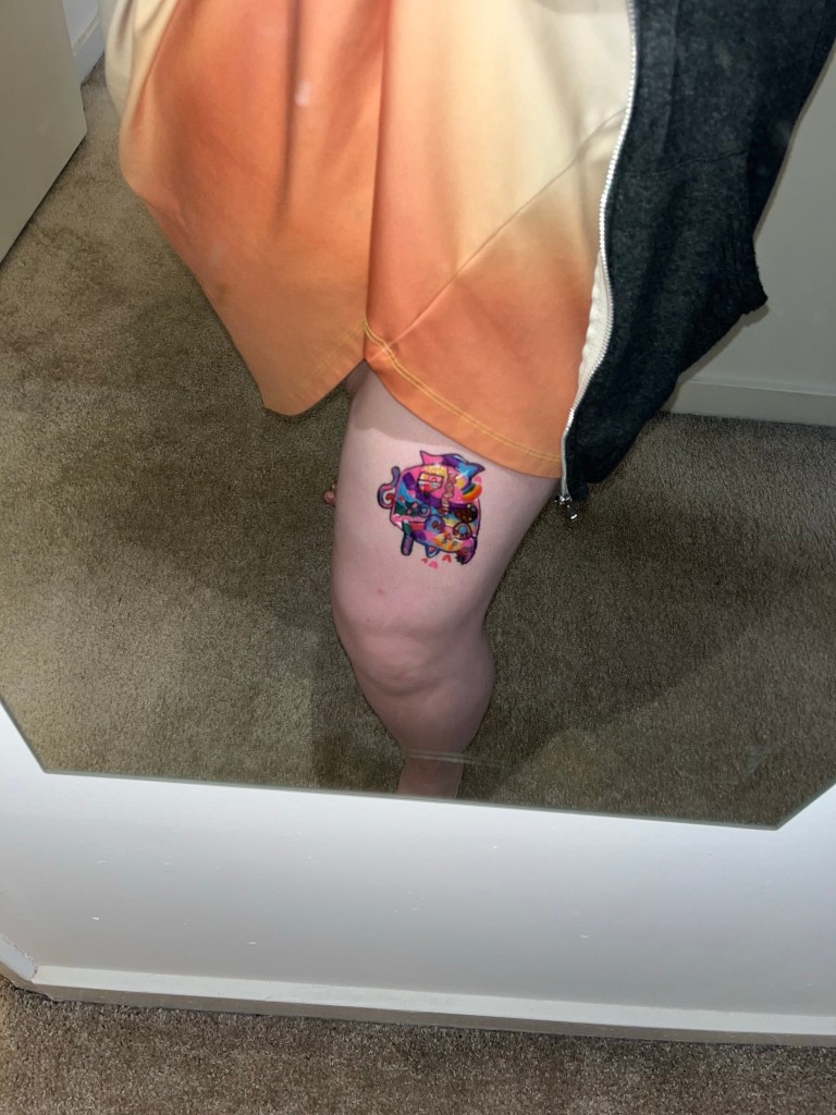
I completed the design with the black outlines and white highlights as described and I’m super happy with how the final product came out! For my convenience I oriented the cat in the cup facing me to draw the design. This means that when standing up, the cat in the cup is upside down to everyone else. I kind of love the upside down version though. It’s giving topsy turvy, it’s giving Alice in Wonderland, it’s very whimsical and I’m here for it.